
From Friction to Flow: Revamping Checkout Experience
Time
3 weeks
Category
E-Commerce Website
Role
Product designer
Facilitator
Prototyping
User interview
User experience design
Unmoderated usability studies
Decathlon is known for its mission to make sports accessible to as many people as possible. The company has been successful in achieving this goal and has grown to become the largest sports goods company in the world. In 1990, Decathlon expanded into the Taiwan market, and for the past 32 years, it has been providing high-quality sports goods to customers in the country. The company's dedication to making sports accessible to everyone has helped it to thrive in Taiwan and become a trusted name in the industry.
6 years ago, the company began developing the e-commerce business in Taiwan and entering the digital marketing industry. As the business grew, it expanded its offerings and began focusing on improving the user experience, customer service, and team excellence.
As we progressed with the expansion and migration of our systems, we encountered a significant challenge: the e-commerce platform we were utilizing was outdated and unable to effectively handle the increased volume of traffic, resulting in poor performance and decreased user satisfaction.
They jumped on a journey to improve the online experience, to make it just as accessible as the brick-and-mortar one. Through careful user research and redesign, the company was able to upgrade the platform and provide a seamless online shopping experience for all users, allowing them to continue to bring sports to everyone.
Existing Issues on the website
The high bounce rate: Confusing and unclear instructions, long and tedious forms, and lack of trust indicators, which all led to frustration, mistrust, and uncertainty among users, causing them to abandon the process.
Long checkout process: Research revealed that the previous version of the checkout process was overly complicated and time-consuming, which resulted in a high abandonment rate and low conversion rate.
The wired flow in checkout: The previous checkout process had not been updated or iterated in a couple of years. During this period, new functions and features were added to the process by different stakeholders, without proper user testing, resulting in a confusing and disjointed user flow.
Use the external page of the bank for payment: Due to the previous website not having SSL security to ensure information security, the credit card information fill-in page is not on the checkout page, but on the external page of the bank with will open a new tab in the browser.
Goal
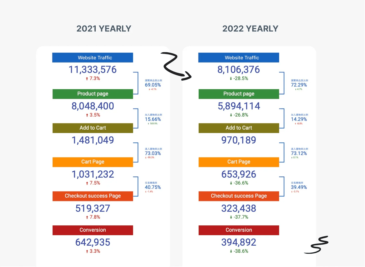
The e-commerce website's checkout page has a high bounce rate and exit rate from 2021 to 2022. Our goal is to improve the checkout process for all users by making it more accessible, smooth, and user-friendly. We plan to evaluate this using the System Usability Scale (SUS). Our efforts are aligned with the company's design principle of accessibility, which focuses on openness, fairness, and equality.
Timetable
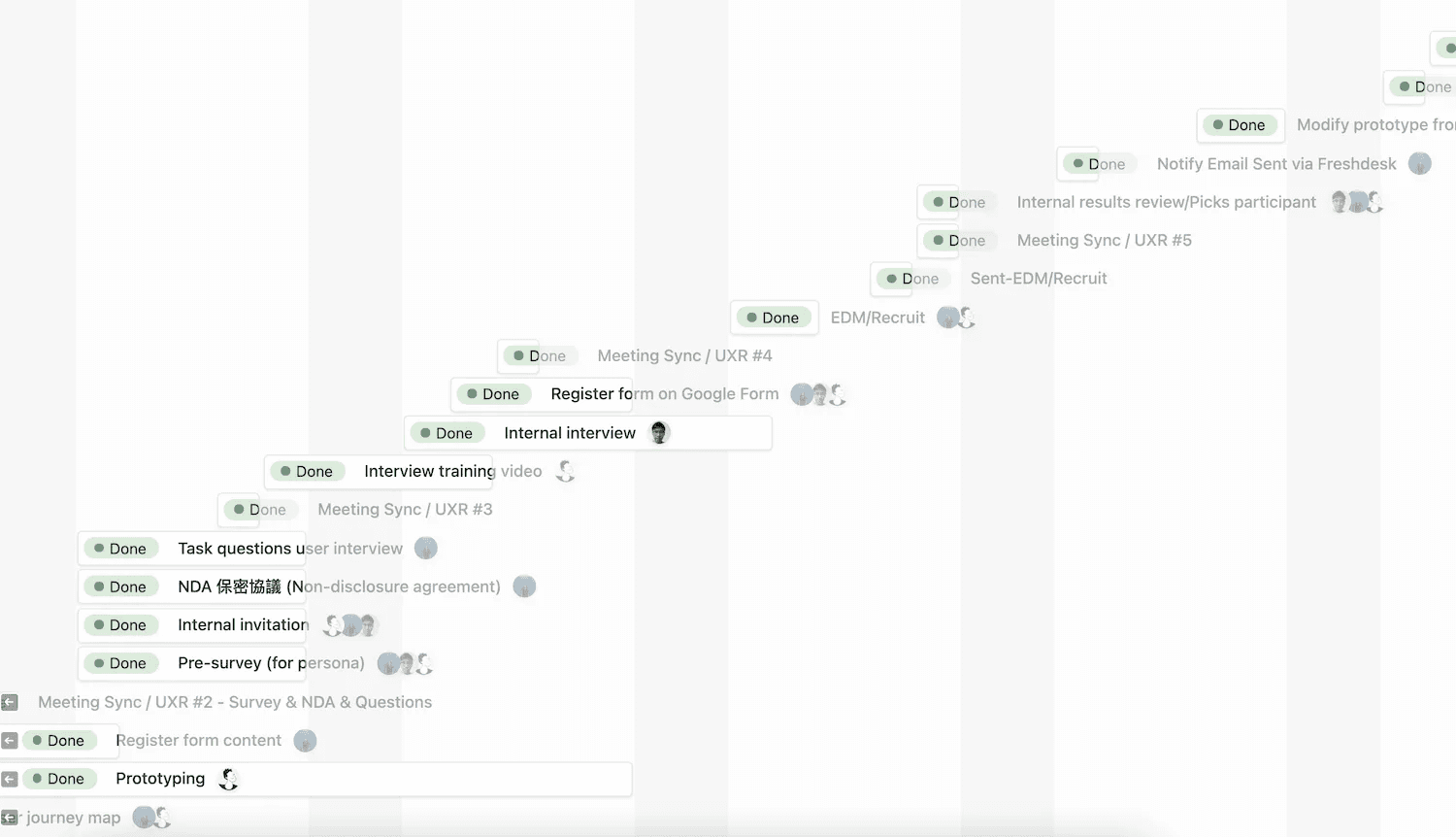
This project is expected to be completed in 3 weeks. The first week will involve designing questions, task planning, and conducting internal interviews and tests with internal users to run the process trial. The second week will involve emailing and recruitment, and participants can use Google Calendar's appointment schedule to book their time. Reporting and analytics will be done in the third week.
Teamwork
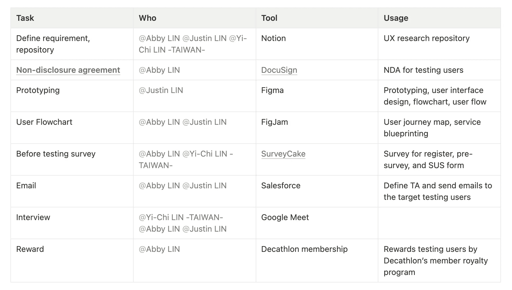
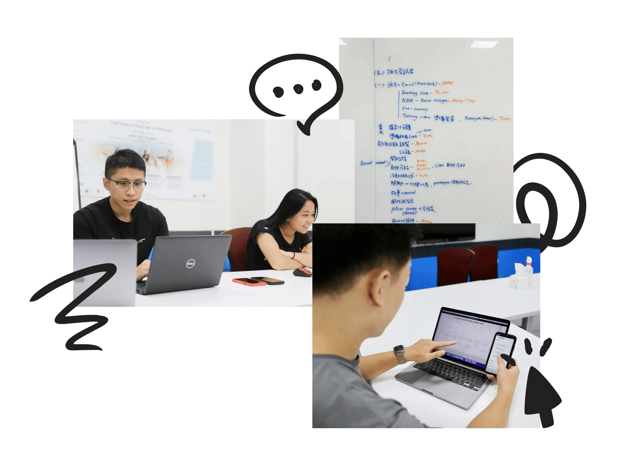
We have a total of 3 people working on this project: a marketer as a user researcher, another marketer as an information architect, and me as a facilitator&product designer. It is important to have teammates involved in the project to build a partnership and help establish the research process from scratch.
Each person is responsible for a different domain. Here is the task assignment table, along with the tools we are using to complete the project. (I'm Chiwu but you can call me Justin)
Discover
User Targeting
In user testing, we divided it into 3 groups based on past usage from users. Then we outlined 3 different shipping methods for online purchases: buying online and collecting at a physical store, paying online or in person and picking up at a convenience store (7-11 / Family mart), and paying online and having the item delivered to the customer's home.
We have divided users into two groups based on purchase history in the past year: those with purchase history and those without. We have also arranged four different age groups (under 26, 26-34, 35-44, 45-55) to discover how different age groups react to our new checkout process and to assess its ease of use. Most importantly, we want to ensure that our process is accessible to as many people as possible.
Validation by SUS
The System Usability Scale (SUS) helps us to evaluate if our new checkout process was easy to use and accessible. The SUS is a good way to measure usability so we can make sure everyone can use the checkout process. This check helps us find things to improve and make the checkout process better.
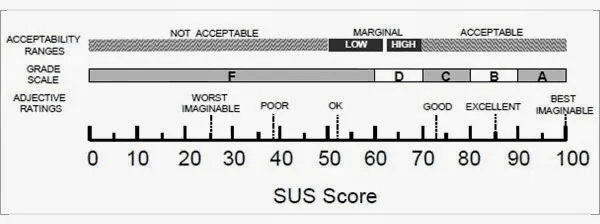
Grade rankings of SUS scores from "Determining What Individual SUS Scores Mean: Adding an Adjective Rating Scale," by A. Bangor, P.T. Kortum, and J.T. Miller, 2009, Journal of Usability Studies, 4(3), 114-123. Reprinted with permission.
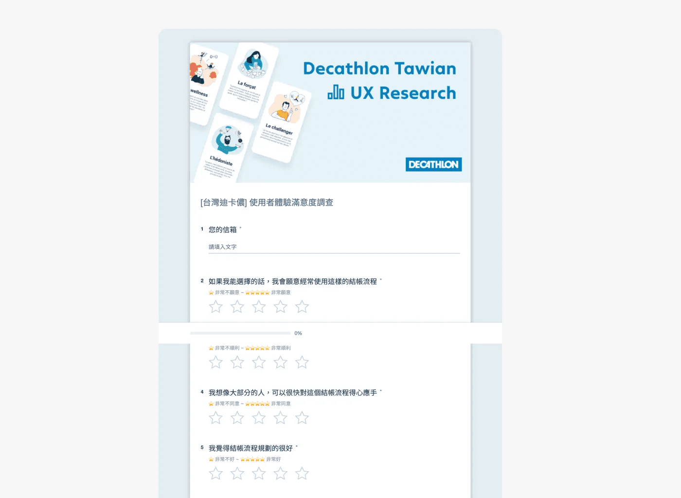
SUS Questionnaire
Our participants are asked to score 10 items with one of five responses, ranging from "Strongly Agree" to "Strongly Disagree". The original System Usability Scale (SUS) questionnaire is based on a system, distinct from our scenario which focuses on the checkout flow. We can apply some of the questions and focus on specific ones.
I would like to use this checkout process a lot if I could choose.
I find this checkout process too complicated.
I think the checkout process went smoothly.
I think I need someone to help me complete this checkout process.
I think the checkout process is well-planned.
I feel the whole checkout process is not quite in line with my expectations.
I think like most people, I can quickly get used to this checkout process.
I find the overall checkout process cumbersome to use.
I can complete the entire checkout process without thinking.
I need help getting the information I need to finish the checkout process.
How we calculated it
You can choose from 5 options, from 1 to 5 points. Each individual question score doesn't matter; the total score is the SUS score.
Positive questions: For questions 1, 3, 5, 7, and 9, subtract 1 from each question's score to get the score for each question.
Negative questions: Questions 2, 4, 6, 8, and 10, subtract each question's score from 5.
Add the above scores together and multiply by 2.5.
The average SUS score is 68, so any score below this is a fail.
( ( Positive questions score - 1) + (5 - Negative questions score) ) * 2.5
Prototype
Validate the design with high-fidelity prototypes to ensure our participants get the closest experience to the actual online product. This enabled us to use the prototype for usability testing and obtain the most realistic user experience.
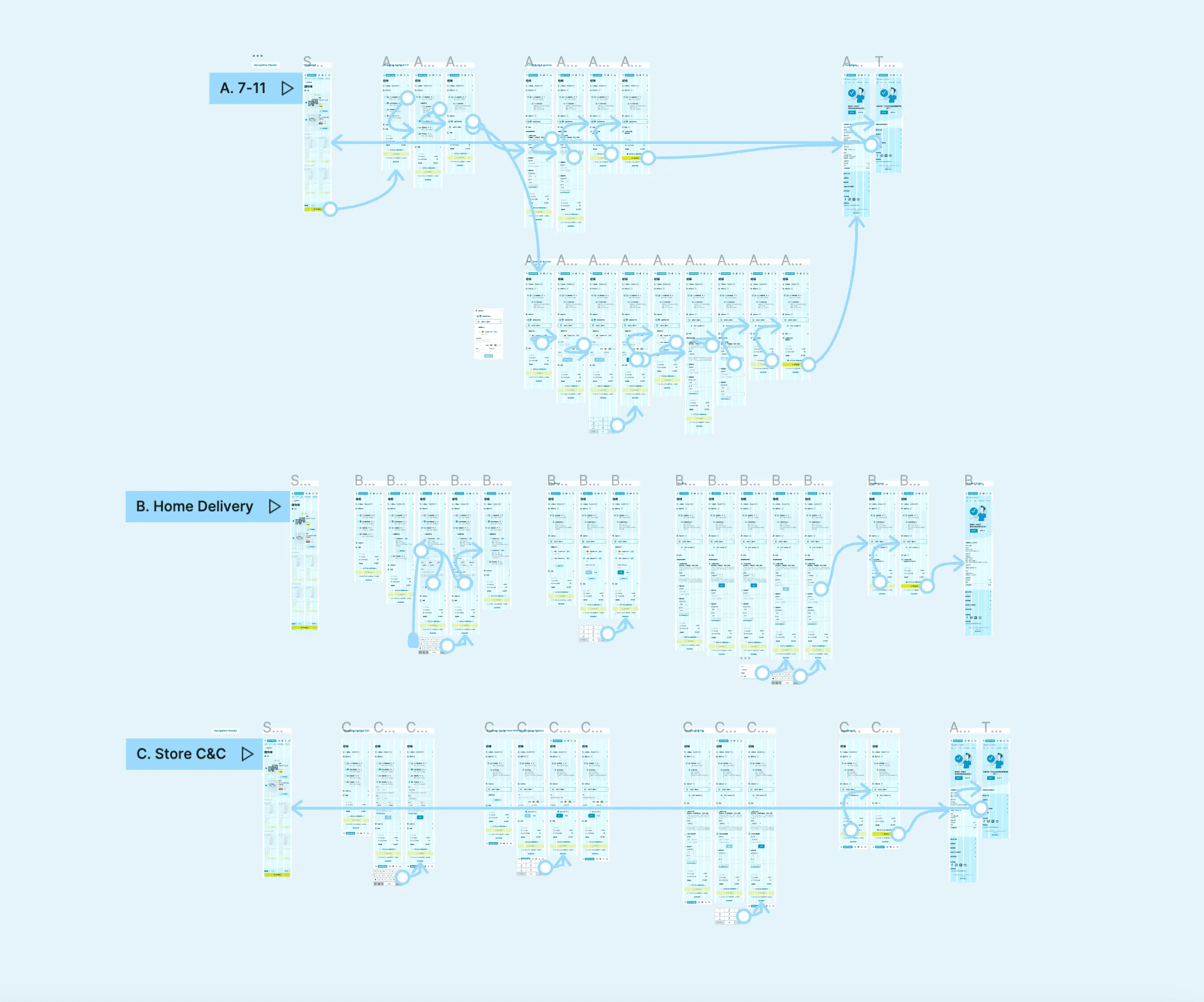
Prototype links
Key findings
User Journey
By understanding the users(participants), their behavior while operating the process, and what can be done to improve their journey.
“Good design is actually a lot harder to notice than poor design, in part because good designs fit our needs so well that the design is invisible,”― Donald A. Norman, The Design of Everyday Things
This quote emphasizes that good design is an important but slight aspect of UX and that its effectiveness can be measured by how little it is noticed. However, these gains and pain points are what I've learned and noticed from the users.
Gain points
The process was smooth and clear.
The feature of saving cards is highly appreciated.
The flow is clear and understandable.
We won't skip any of the steps, even though they are all on the same page.
Pain points
The prototype's limitations prevented the page from automatically scrolling to the next section.
In the payment section, why combine adding a card and selecting it as one step?
The "Save card" feature has both advantages and disadvantages; users have expressed concerns about security.
Sometimes users don't know which step I'm in when a user is scrolling intensely.
Certain inputs didn't have an alert caption under them, as the prototype's limitations prevented it from showing instantly.
Comments from participants in the usability test
I don't have to worry about accidentally filling in the wrong information and being scared by re-filling the current page if go back to the previous step.
Compared to the previous checkout process, the new version of the process allows me to save cards and complete checkout faster.
If there is a progress bar on the page, it would guide me to know which step I’m in.
How easy was the task
94.1
Participants rated the process in SUSon average. It was an excellent result in the SUS acceptability score.
Implementing feedback
From the usability testing, I gained an understanding of key points that needed work. I then looked at potential solutions and mocked up some screens to see how the pain points could be addressed.
Payment
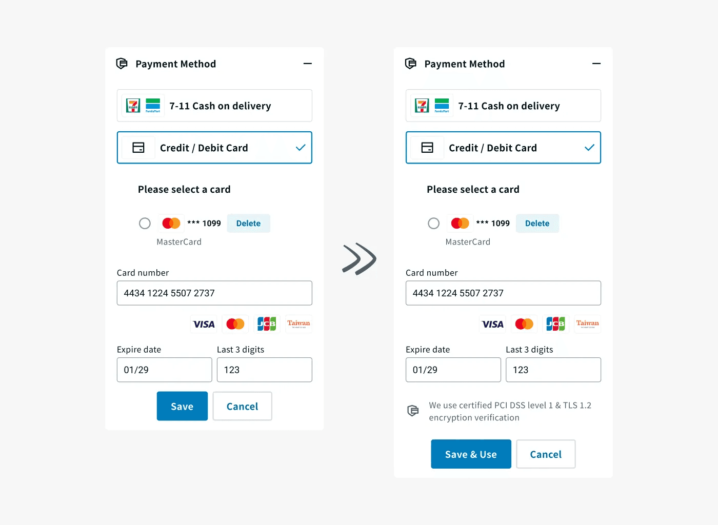
A "Save & Use" button was added to the checkout process, allowing users to save their payment information for future purchases, and without the need to click on the radio button after saving the card. (Only for the user who hasn’t added any card)
On top of that, an encryption verification security context was added to address users' concerns and anxieties about the security of their payment information, making them feel more comfortable and confident when making purchases.
Progress bar
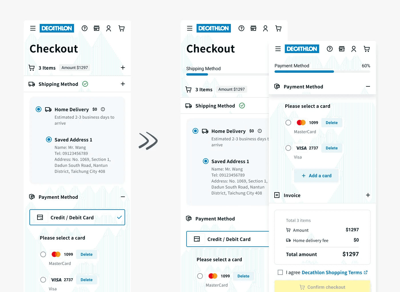
A progress bar was added to the checkout process to give users a visual indication of their progress through the different steps. Even when the user scrolls, the progress bar will remain fixed at the top, along with the step title.
Next steps
Considerations
From the usability testing, I gathered a lot of qualitative data which allowed me to understand key improvements that could be made. Certain aspects of the designs need to be more intuitive and visible.
On top of the insights on improving the feature itself, there are more complicated steps that will be added in this checkout process, such as multiple suppliers shipment, and third-party payments, as Decathlon Taiwan plans to have a marketplace that allows more sports brands and products on their e-commerce website in long run.
More testing
Due to time constraints, the version that I implemented won't be online soon. However, I can get more qualitative feedback through the upcoming minimum viable product's user acceptance testing and find more user pain points to iterate and optimize the experience in the future.

